dotCSS is the largest CSS conference in Europe. The 2017 edition occurred late November in Paris and it was a great opportunity to exchange and learn from the community. As you can play back the talks on the dotConferences website, this post won’t dive into the details of all the conferences, this is a digest of what what was most interesting for us.
Tim Carry from Algolia told us how he built a search engine with CSS only. It uses the power of selectors, as the language is super powerful at targeting elements in the HTML and applying style to them.
The search bar is a simple input tag which has a value attribute. Thus, a CSS selector will be able to match this input when it has a specific value.
Actually the search engine cheats somewhat, as the value attribute has to be updated each time something is typed with a JavaScript statement. But this is the only line of JS to make it work 🙂
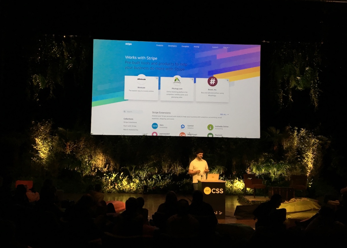
grid CSS propertyBenjamin De Cock from Stripe showed us how cool the grid CSS property is. This property is mainly used by Stripe on their website’s backgrounds and often combined with a skewY property.
Quickly, here’s how it works: the grid area is made of multiple span tags where each one can receive a specific style. In comparison, Flexbox is great when working on a single axis but grids are easier to deal with on two axes.
 We are also using a grid on the Drivy homepage
Unfortunately the browser support is not that good yet: depending on your target audience, decide if you need a fallback style or if it is reasonable to drop support for older browsers. Anyway using the grid CSS property with simple rules gives a bunch of possibilities.
Adam Detrick, Web Engineer & Design Systems Lead at Meetup talked about the difficulty of maintaining a sustainable style codebase.
He explained that as reading CSS is too complicated we are used to writing new components and to adding new styles. We should write less of it and break the vicious circle by framing the problem correctly and thinking more about the developer experience.
For instance, he mentioned that using these kinds of utility classes could be a step in the right direction:
at[breakpoint]_[property]--[variant]
An example would be atLarge_align--center where the text inherits the default left alignment but at large viewports the text is centered.
Finally he also mentionned the fact that the documentation should be kept as close to the code as possible. In this way, using a documentation generator could be useful.
Member of the CSS Working Group, Florian Rivoal presented the Media Queries Level 4 which offers some syntax improvements regarding the range, the boolean logic and shortcuts.
He also explained that using Media Types is not a good idea anymore. For instance, using @media screen {...} goes for a smartphone, a TV screen, a laptop… Perhaps we want different behaviors on each ones: using Media Features we could match with a precise device such as a Wii, a phone, a e-ink media and so on.
Finally, he gave us some best practices.
Don’t:
px to define size.Do:
em to define size.Laurence Penney created Axis-Praxis which is an environment for playing with Variable Fonts.
You choose fonts then you can adjust sliders and play with precise settings on the variations axes built into them. It relies on the font-variation-settings CSS property and this lets us experiment what the future of Variable Fonts may be.
Check it out on Axis-Praxis.org 😉