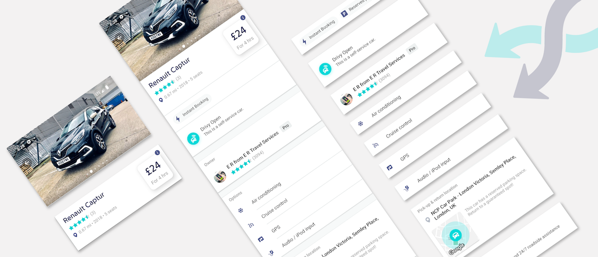
For some time now, we have been heavily relying on our API to display formatted content on our apps API Driven Apps. It enables us to be more agile, by shipping new features faster and easily iterating on them without updates. Recently, we pushed this paradigm even further, generating complete native views from the API with our design system.
There are several advantages to this, you can:
Plus, you build your new features based on native views to keep the best experience for the end users. Let’s see how its work.
A design system is a collection of components that can be reused in different combinations to build your UI. It also includes colors, spacing and typography specifications. Design systems allow you to manage design at scale in order to build consistent websites and applications. Every component has its own purpose, and can itself show or hide a subset of information depending on the context.
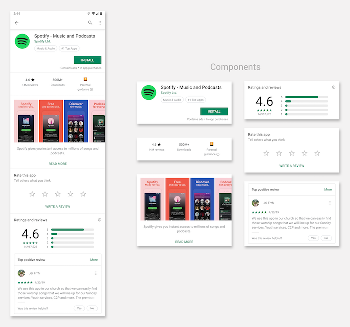
Here’s an example of what the components in the Play Store App would be:
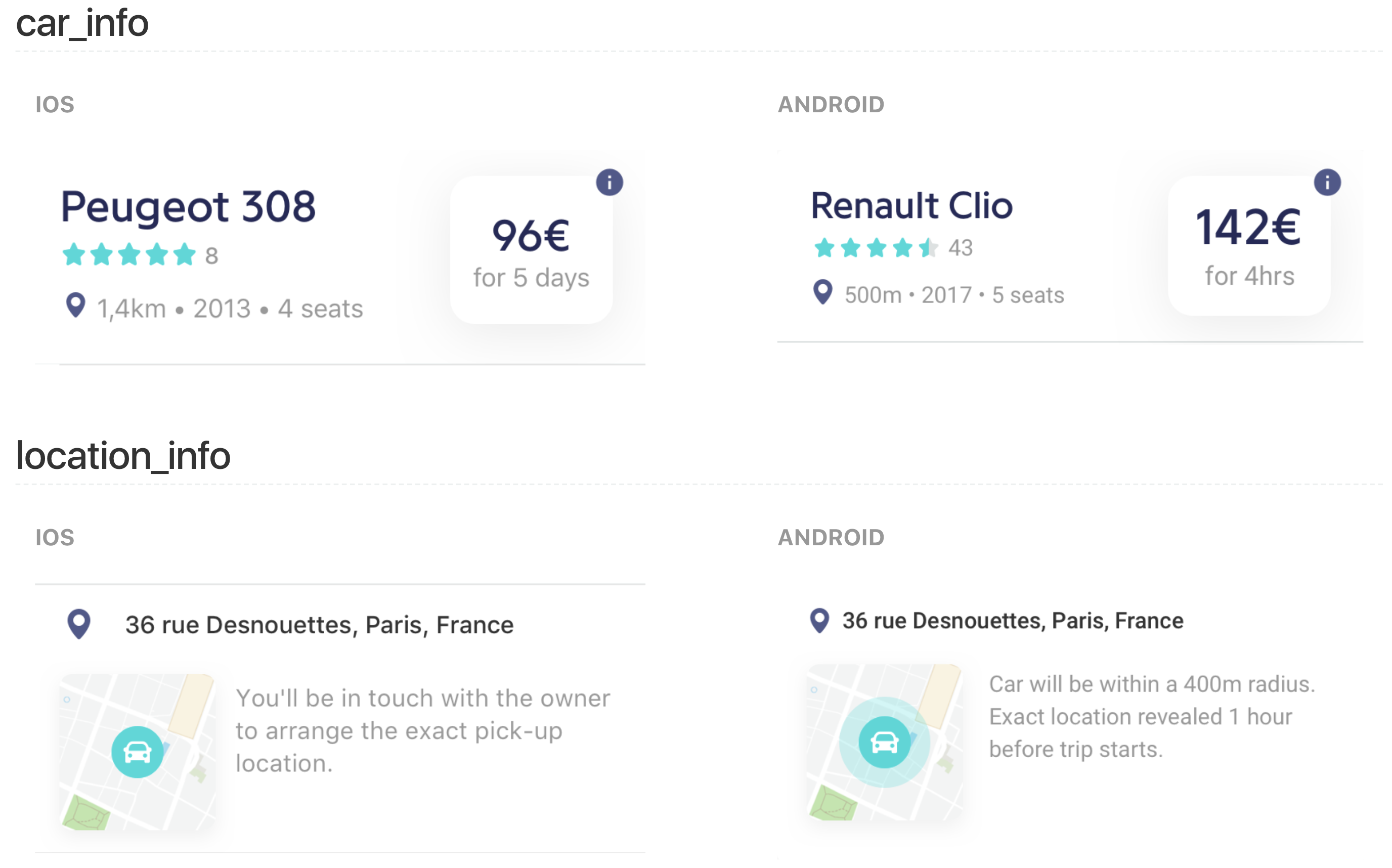
At Drivy we have built our own design system in order to develop consistent UI across all screens of the application. Our design team has worked on a series of components for both iOS and Android in order to respect the specific guidelines of each OS. Every component has a name and an associated custom view in our code base.
Here is a sneak peek of what it looks like:
The purpose of these components is to display information to our users. This information will most of the time come from a call to our API. So we decided to associate a JSON schema to every component of our design system.
Let’s take a simple component:

There are 3 pieces of information in this component:
Drivy OpenThis is a self-service car.The associated JSON schema will look like this:
{
"type":"basic_subtitled",
"title":"Drivy Open",
"subtitle":"This is a self-service car.",
"icon_url":"https://drivy-assets.imgix.net/icons/open_badge.png"
}
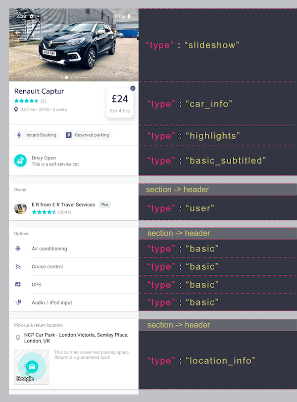
Each component has a type property, defining what kind of component it is. Here comes the magic: we can now have a list of components returned by the API, in order to build an entire screen. The type is used to deserialize the appropriate object and bind it to the appropriate custom view associated to the components.
Let’s take a example with our car details screen:
We have commercial vans on our platform. A few months ago, we decided to add all the dimensions of the vans to help our users know exactly what kind of furniture they can carry with the van.
As you can see below we were able to add a complex composant to the screen:
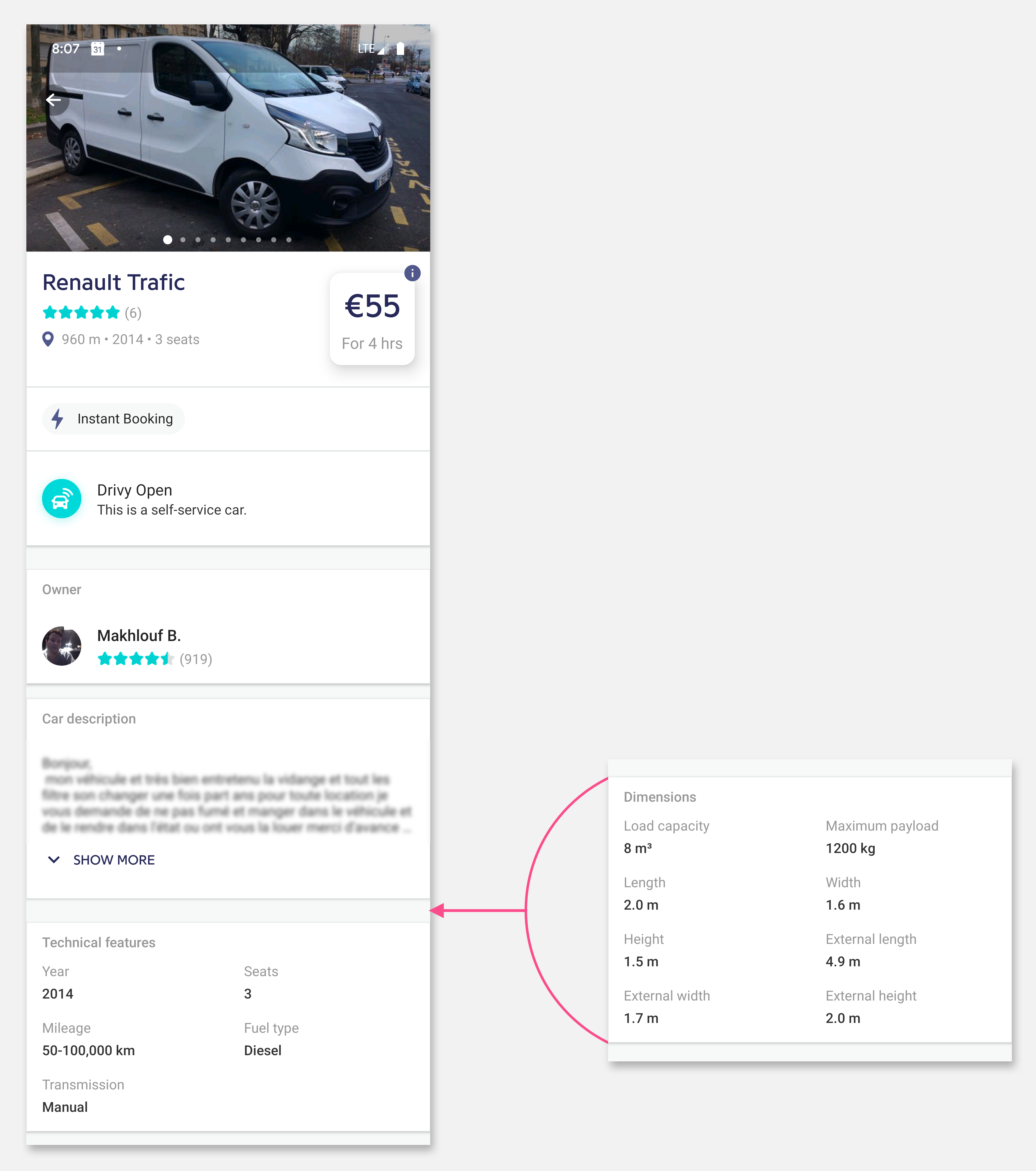
This change only required an update of the API, it’s win-win for everyone:
As with every software solution there are some drawbacks, this will no be the perfect solution for all of your screens:
We have been using this technique for a few months, and we have already seen the benefits for some features. There is a small start up cost of setting it up in your app and API, but we definitely think that on a long terms basis, it’s a valuable and powerful tool for quickly building a new feature, in a scalable way.
Not all of the screens in your app will match with API/design system technique, but when it comes to a new screen you can ask yourself the following questions:
If the answer to all of these questions is YES, it could be a good solution to go for.